Logofolio identity, reduced to its essence.
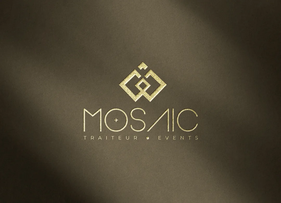
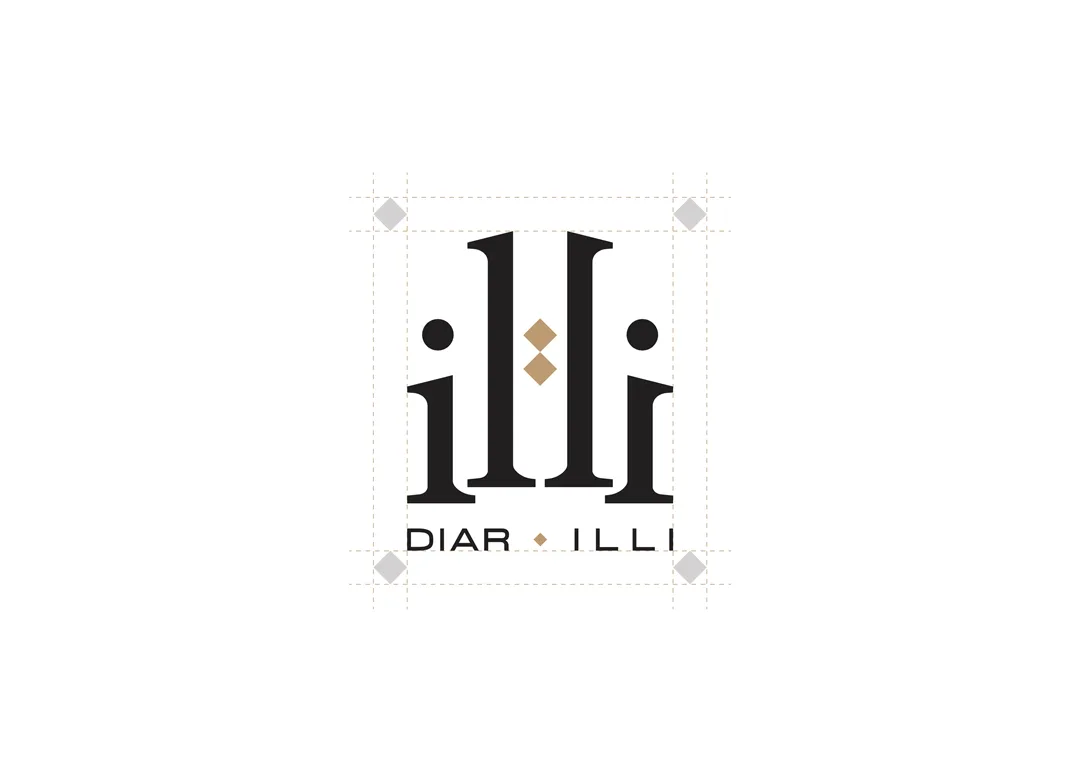
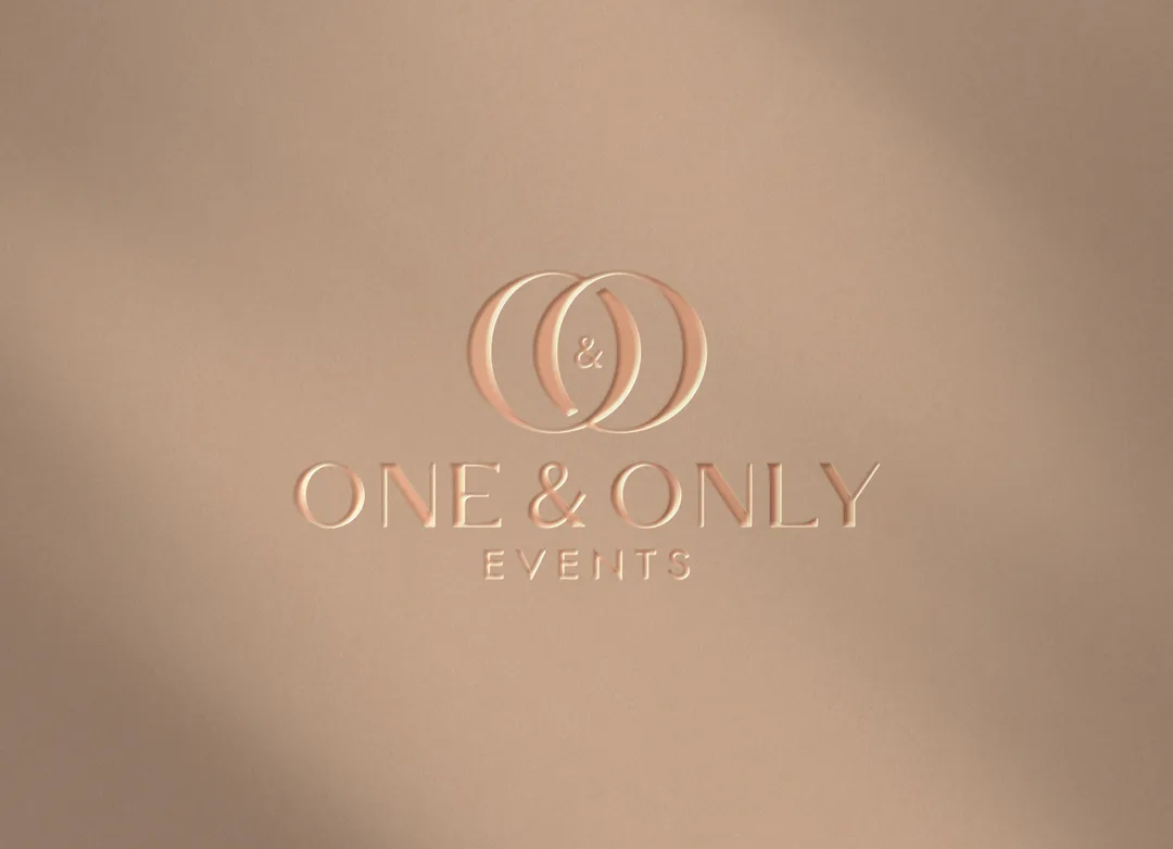
What makes a good logo? Far more than a nice drawing: it's the visual synthesis of a brand. This logofolio brings together a selection of logotypes designed by Studio 212 and tells the story of how we approach brand identity.
A studio, a signature.
Since 2007, Studio 212 has designed visual identities for brands across very different worlds: local shops, retail chains, institutions, cultural projects and service companies. This logofolio gathers a selection of that work, as a window into how we see branding. It isn't a simple catalogue but a testament: to a constant practice of brand design, refined over hundreds of hours of graphic research and dialogue with clients whose ambitions vary widely.
A logo is never an end in itself: it's the starting point of a complete identity. It condenses a brand's personality, sector and promise into a single sign. Bringing this work together in one place isn't about showing off isolated drawings, but about revealing a working method and a constant standard. Behind every logotype shown here lies the same concern: finding the most accurate form, the one that says the most by showing the least, and that will accompany the brand for the long haul, well after today's graphic trends have faded. Some of these identities were designed for young projects seeking credibility; others for established organisations wanting to reinvent themselves — but the starting point is always the same: listen to the brand before drawing it.
The challenge we faced.
Designing a relevant logo means solving a difficult equation: being instantly recognisable, working at every size and on every medium, and standing the test of time without going out of fashion. A logo that's too busy dilutes itself; one that's too generic blends in with competitors. On top of that comes a technical constraint: the mark must remain legible whether engraved on a tiny stamp or displayed large on a storefront, in colour or in black and white, on screen or in print.
Then there's the challenge of the system around it. A logotype never lives alone: it needs a system — colours, typography, variants, usage rules — that guarantees consistency on a business card as much as on a shopfront or a screen. Without that framework, even the best identity ends up scattered, with everyone interpreting it their own way until recognition blurs. A logo only has value if it's used correctly, which means thinking, right from the design stage, about how it will live in the hands of the people who will actually use it.
Our methodical response.
Every identity in this logofolio follows the same approach, led by our Branding practice: understand the brand and its market, explore a range of graphic directions, then refine the chosen mark down to its essence. We favour clear, memorable, adaptable forms over effects destined to age badly. This exploration phase is essential: it's by confronting several directions, sometimes radically different, that the right path emerges — then it's worked until only what's necessary remains.
Each logotype is then developed into a coherent system — variants, palette, typography and usage rules — so it holds up across every medium. This visual foundation becomes the base for consistent communication, from print through to social media, and a lasting asset for the brand's reputation. By providing clear rules, we give our clients the means to run their identity independently, without fear of distorting it through use. This system is all the more valuable given that an identity is bound to pass through many hands — printers, suppliers, in-house teams — none of whom should have to guess how to use the logo correctly.
- Immersion in the brand and its sector
- Exploring directions and selecting the concept
- Refining the mark and finalising the logotype
- Consistent variations and usage rules
The levers we used.
This logofolio draws on experience the studio has built up over the years, and on one shared conviction: a good logo is judged by its use, not just on a presentation board. Strategic distance, graphic rigour and attention to detail are the constants in each of these creations. We give as much weight to the idea as to its execution: a strong concept poorly drawn loses its force, just as a beautiful drawing with no idea behind it stays decorative and is soon forgotten. It's at the meeting point of an accurate intuition and flawless execution that identities that last are born — the ones people end up associating instinctively with a brand, without even needing to read its name spelled out.
The diversity of the worlds represented here is a strength: it shows our ability to adapt to each sector without imposing a uniform studio signature. Every brand keeps its own singularity, while benefiting from the same design rigour. This versatility is the fruit of attentive listening: before drawing, we first seek to understand what makes a brand unique, so its identity becomes a sincere expression of it rather than an interchangeable form. It's this curiosity for every trade, every story and every audience that keeps the studio from repeating itself and maintains, project after project, the freshness of its eye.
What we take away.
The quality of a logo is measured by its simplicity and its ability to last. The strongest identities are often the most sober: they say the essential and let the brand exist. A successful logotype is never an end point, but the first step of a complete, coherent identity, destined to unfold across every touchpoint of the brand, from the most modest to the most visible. It's also a sound investment: a solid logo lasts for years without a costly redesign, whereas a poorly conceived identity eventually forces a full overhaul, at the cost of a reputation patiently built and then lost.
Bringing these creations together in a single logofolio reminds us of something obvious: every brand deserves a mark designed specifically for it, not borrowed from a passing trend. Do you have a branding project, a creation or a logo redesign in mind? Talk to our team or explore our other work.
Measurable
results.
Indicators recorded on the mission (indicative figures, to be personalised with your own data).
In pictures.
An identity to create or evolve?
Tell us about your brand and your goals. We'll get back to you within one business day with an initial creative approach and a clear estimate.
- A reply within one business day, no strings attached.
- A single point of contact, based in Marrakech.
- A transparent estimate of budget and timeline.
Let's talk about a branding project
Reply within one business day. Your data stays with us.
Request sent!
Thank you! We'll get back to you within one business day.